- Create
- Community
- Blog
- About

How to Choose the Perfect Colors for Each Room in Your Home
 by DecorMatters|updated Jul 19, 2022
Color isn't just an aesthetic - it can affect your mood, your emotions, and even your behavior. In your home, color is a huge part of establishing a theme or a narrative within a space. It can also help establish the purpose of a particular room.

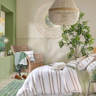
📷 Roma
The problem many people face, however, is the difficulty of choosing colors. There are more than 10 million colors, and like other elements of interior design, colors can come and go in fashion. At the same time, things like space, lighting, coordination, and patterns have to be taken into account during the consideration stage. How then, do you commit to the perfect long-term colors throughout your home? Here are a few tips from the experts:
Strike a Balance
When it comes to colors, too many can be overwhelming, while too few can look a little dull. Instead, try to find a balance in the colors you opt for. Start by picking a color for the biggest, most centrally located room - this will then serve as the heart of your home and give you a base to tie all your coloring back to.


If you have a statement piece in any of the rooms - for instance, a large rug with maroon stripes - pull colors from it to tie the overall area together. Another trick is to concentrate darker colors to the floor level and gradually get lighter towards the ceiling. This technique elongates rooms and mirrors the natural effect of being outdoors, which creates a natural, comfortable ambiance.


Some interior designers follow certain rules when choosing colors. The 60-30-10 rule states that 60 percent of the room should have the dominant colors you've picked (like your walls), 30 percent should display your secondary color (like the furniture), and 10 percent should have the accent color (like accessories). Alternatively, other renovators prefer using the rule of three, which advocates using only three colors to avoid over-saturating a room.
Trust the Classics
Black, white, and gray are timeless colors that are easy to pair with pieces because they set a sturdy foundation that can amplify other shades. In particular, black and white with dashes of metallic colors will give the illusion of elegance and are ideal for smaller spaces like a walk-in wardrobe or hallway. For bathrooms, experiment with mineral colors against black and white, as these transform typically 'functional' spaces into luxurious ones.


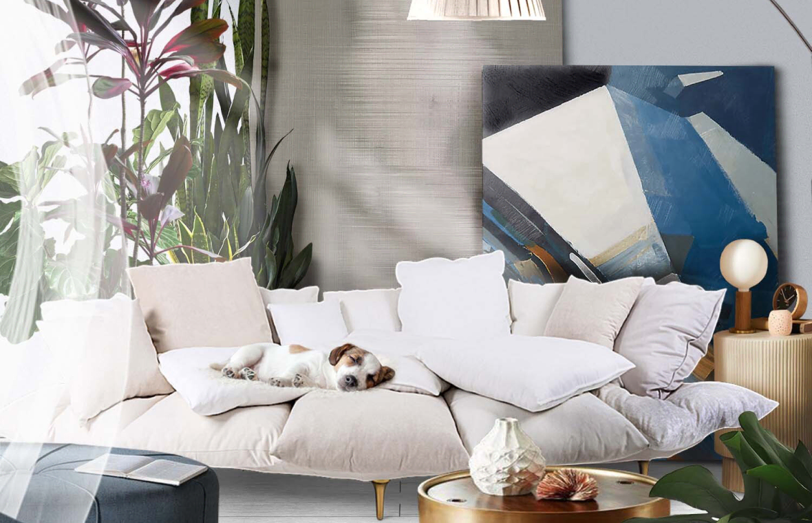
📷 Camille
Meanwhile, gray has the unique ability to appear either warm or cool, so is versatile in the types of rooms it fits. To liven gray up, combine it with pastel colors which soften the color palette and go perfectly in bedrooms.
If you prefer classic colors with a little more excitement than black, white, and gray, colors next to each other on the color wheel tend to be complementary. If you're stuck for inspiration, this is a wise place to start.
Infuse Personality
It's easy to get lost in design trends and forget to add your personal taste to your home. Remember to embrace the colors that you love and build a wider color map referring to those choices. If you're unsure where to begin, do some research and browse magazines, websites, and even your friend's homes for color pairings that immediately grab your attention.

Don't be afraid to incorporate your favorite artwork into your color scheme too. Perhaps you have a painting or photo that could motivate your color selection, and generate a customized flow throughout a room. Likewise, play around with lighter and darker tones depending on what you most regularly do in each room. For example, lighter colors in the kitchen can spark creativity, while darker colors in lounge areas will seem cozy and best for relaxing.

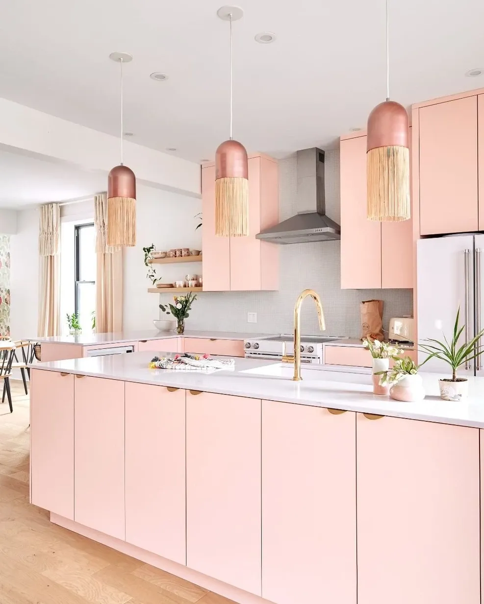
📷 Amanda
However, you choose to approach your color strategy, be sure to sample the colors before you commit to them entirely. You can go the traditional route of painting squares on the wall, or for a modern solution, the DecorMatters app uses augmented reality to allow users to visualize changes in advance.

Socialize


 21h left